 Two years ago, or even three, when I first started out on Twitter, my first agent saw a book of Tweets. I wasn’t sure but he was – and he was a real old school agent, specializing in business, tech and pop culture. His client list was phenomenal – and he was a good friend’s agent and came highly recommended. Except the publishing community wasn’t into it – they still didn’t know what to make of Twitter (and, frankly, the publishing community is still trying to figure a lot of things out, least of all social media). I didn’t blame them then for not jumping at the book – every Twitter book I’ve seen hasn’t really worked. Twitter is a digital medium using words but that doesn’t mean it migrates to print. There’s only so much you can do with 140 characters on a page. I always thought you need illustrations, at least, if you were doing a book. A book of Tweets needed to exploit print – it needed to be printier than a normal print product. It needed a kind of feeling. And if it were a book, the illustrations needed to either be incredibly elaborate, or simple – like New Yorker cartoons. Or…like old Peanuts.
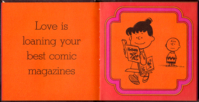
The great site brainpickings.org is always good to jog the brain cells (honestly, it’s one of the best sites on the whole internet). Remember these books? The philosophy in Peanuts rendered simple? These books are like perfect pop culture hallucinations, the 60s perfectly rendered. This is kind of what I see the Twister project like – regardless of medium. Oddly retro to counterbalance the nowness of the thing. A revert to print kind of book should look like it’s reverted way back. Because if you go from the web to print (and there’s been so much of this already), your book, the very action, is like entering a way back machine. And that’s kind of cool.